2016
The Worst Design of 2016 Was Also the Most EffectiveFast Company, 12.16.2016
How to Fix Design
99U, 2016
2017
Resistance in DesignCommunication Arts, Fall 2017
How the Trump Hat Became an Icon
CNN, 02.17.2017
I’m With Her
Michael Bierut, Design Observer, 03.28.2017
2018
The Brilliance of Alexandria Ocasio-Cortez’s Bold Campaign DesignVox, 07.02.2018
2019
After the Gold RushA decade ago, the center of the design universe was New York City. Now designer reflects on the mass migration of talent to Silicon Valley
Eye on Design Magazine, issue #4, 2019
We Asked Design Experts What They Think About Pete Buttigieg the Brand
Jezebel, 04.17.2019
How Pete Buttigieg’s Branding Went From Traditional to Opensource
AIGA Eye on Design, 05.23.2019
Sans Serif, Sans Progressive Policies:
How campaign branding came to be a way for candidates to signal their progressive bona fides without actually having them
The Outline, 07.03.2019
Don’t Worry, These Gangly-armed Cartoons Are Here to Protect You From Big Tech
AIGA Eye on Design, 08.21.2019
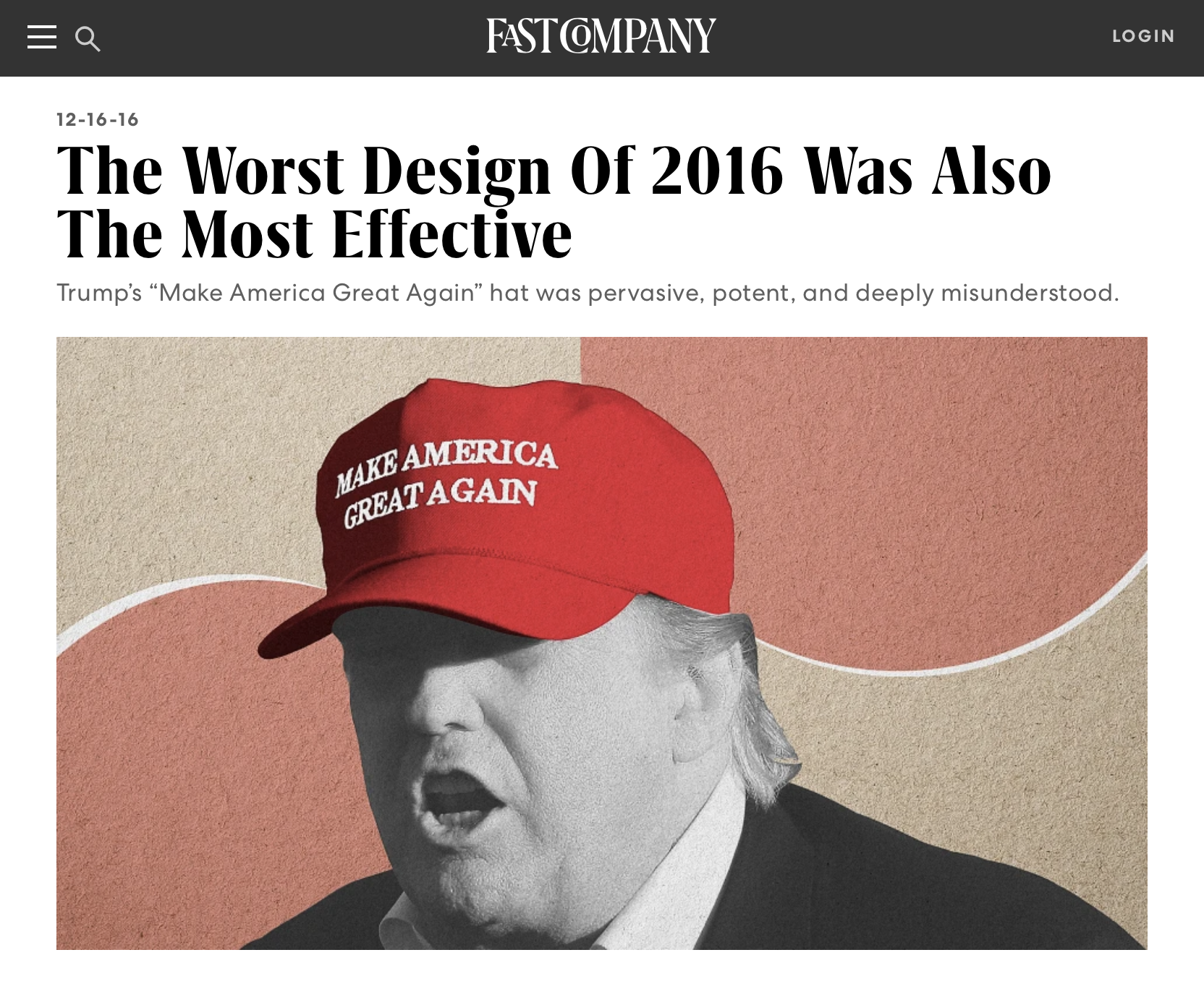
The Worst Design of 2016 Was Also the Most Effective
Trump’s “Make America Great Again” hat was pervasive, potent, and deeply misunderstood.
Fast Company, 12/16/2016
“No one wants to give [Trump] credit, understandably, because it’s not something that was designed,” says Lindsay Ballant, a designer, art director of The Baffler, and adjunct professor at the Maryland Institute College of Art. “It should be something that designers think about. Good design doesn’t necessarily mean effective design.”
“Maybe [designers] got too high on our own supply from [the Obama campaign] because the branding and approach was so different,” Ballant says. “It all goes back to the idea that I now understand as the creative class as an extension of the professional class and the bubble that exists . . . we’ve blocked ourselves off and we’re not talking to anyone else outside of that. Or we assume there’s enough of us in that we can prevail and it’s not true anymore.”
Ballant reiterates that Obama and Hillary’s campaigns were rooted in corporate identity design and points out that corporations aren’t very popular right now. “Hillary’s branding felt too corporate,” she says. “But that also reflected an entrenched reputation she had to push against. And the design, while very good, unfortunately only served to reinstate that fact, especially when you think of how big of a deal it was when the logo was unveiled. It was treated like a Mastercard, Airbnb, or Uber reveal.”
The 2016 campaign revealed limitations of what “good design” can achieve as a communication tool in a political context. “Good design has an elitist bias, particularly because good design is expensive,” Ballant says. The role of designers in a political context when capital-d Design is so suspect is no less important, but it will take some retooling.
In October, Ballant presented a lecture to the AIGA NY, which Matt Ipcar moderated, about what design can and can’t do in the context of an election. During her talk, she drew parallels between the presidential campaign and the United Kingdom’s “Brexit” vote to leave the European Union, and referenced an article London-based Pentagram partner Marina Willer wrote for Eye. In the piece, Willer expressed guilt about what designers weren’t able to accomplish.
It’s not that our industry was silent. Many campaigns were crafted for the Remain camp and many things were said. We created clever campaigns, beautiful campaigns, and funny campaigns, but we created them for each other, myself included. By and large we preached to the converted, when what we needed to do was to give those who were undecided some clarity. To change history we needed to directly speak to those who chose to vote leave by communicating simple information and direct implications.
Ballant found herself wondering about what can happen when design isn’t overthought or overproduced with the hat as a prime example. “The making of the hat, the actual idea of it, might have come from a brand strategist or it might not of, which is kind of the salient point,” she says. “It certainly wasn’t a ‘design first’ strategist or thinker. It didn’t come from a team of design experts. It’s not slick. Its origin seems spontaneous, not thought out. It seemed like it was a one off made on a whim, without any thought as to how it operated within a larger system, or without any expectations as to what its impact was or what system it built off of. It didn’t seem like it came from a pitch deck. It was, like Trump, sheer personality.”
While Ballant is far from calling for a revolt against design systems and style guidelines, she advocates a broader tool kit for designers. “In a way, the fluke success of that hat was a rejection of ‘design thinking’ and ‘design strategy’ as a whole,” Ballant says. “And designers should really think about that, because we’ve built a whole economy around that as a practice. We’ve sold ourselves on the premise that this is how things should be done.”
She argues sometimes it might be strategic for designers to ignore instincts about the visual aspects of design–like kerning, typography, and a systematic polished sensibility–and embrace an “undesigned” approach since it might be more relevant or effective in certain situations. “Hillary’s direction was universally praised as good design,” Ballant says referring to the sophisticated direction Hillary took. “The pundits were all wrong, the pollsters were wrong, and the design class was wrong, too.”

How to Fix Design
Twelve leading designers and creatives come together to point out what they feel is the most pressing issue in the field of design today—and how they would fix it.
99U, 2016
Problem:
There’s a lack of diversity within design schools.
Antidote:
“This creates a domino effect, pulling from the same pool of people, pulling from the same kind of class. We’re accepting the same kind of class, with a disposable income that can afford to send their kids to a certain kind of school or live in a certain kind of city—it’s a cycle. If I could change one thing, I would try to make the design world less self-reflective, and I’d try to inject more hubris and humility into the design world. I’d try to encourage designers to find more balance and to not be completely obsessed with design all the time, to have a better foundation in the real world.
There’s a real disconnect from reality when you get into the real design world and that extends to designers making publications for other designers and having the pressure to have this perfect looking Instagram or Tumblr or Twitter account. Like, is that the point of design? I don’t think it is. I wish there was more curiosity in the design world.”
—Lindsay Ballant, Creative Director, Foreign Policy

How the Trump Hat Became an Icon
CNN, 02/17/2017
“It was un-designed,” Lindsay Ballant, a designer and adjunct professor at the Maryland Institute College of Art, told CNN. “It didn’t represent what one thinks of when you think of traditional politics in terms of visual messaging, and that's essentially what Trump was as well.”
The type is default, Times New Roman, the color design is basic, and the style, sitting oddly high on the head with a slender rope stretching across the front, matches the hats Trump has long worn on his golf courses.
“In contrast, Hillary’s campaign was incredibly thought out. It was elaborate. There was a whole system driven around the simplicity and the beauty of the logo mark,” Ballant says of Trump’s opponent’s campaign.

Resistance in Design
Communication Arts, Fall 2017
Soon after the election, Lindsay Ballant, Baltimore-based art director for The Baffler, who had previously designed a series of black-and-white pins with progressive messages, produced “Call Your Congressmen” and “Call Your Reps” buttons. Ballant is donating her proceeds to a range of organizations corresponding to the buttons’ messages, including Democracy for America and Jobs with Justice. With buttons that read “A Living Wage” and “We Are All Workers,” she aims to draw attention to labor issues. “After the election, there were many stories and roundup posts listing organizations … where people could offer their support,” Ballant says. “But none of them were addressing labor rights. That was astounding to me considering… we just had an election where economic anxiety was front and center.”
Ballant is among the creatives who engaged in political discussions long before the election. The introduction to her online store, Goods for Revolution, urges visitors to “ask uncomfortable questions and have uncomfortable discussions.” “Many designers refrain from talking politics because, I imagine, they don’t want to be seen as polarizing or divisive,” she reflects. “But now that the status quo is, by default, offensive and controversial, you see more people speaking out.”

The Brilliance of Alexandria Ocasio-Cortez’s Bold Campaign Design
Vox, 07/02/2018
Lindsay Ballant, an adjunct faculty member at the Maryland Institute College of Art and art director of the magazine The Baffler, argues that the success of Ocasio-Cortez’s branding is that it doubles down on who she is and the strength she’s capable of as a lawmaker.
Through its style, her branding clearly conveyed her campaign’s “fearlessness in taking on a comfy establishment figure,” Ballant said. “The design just had to enhance that and, frankly, make sure it didn’t get in the way.”

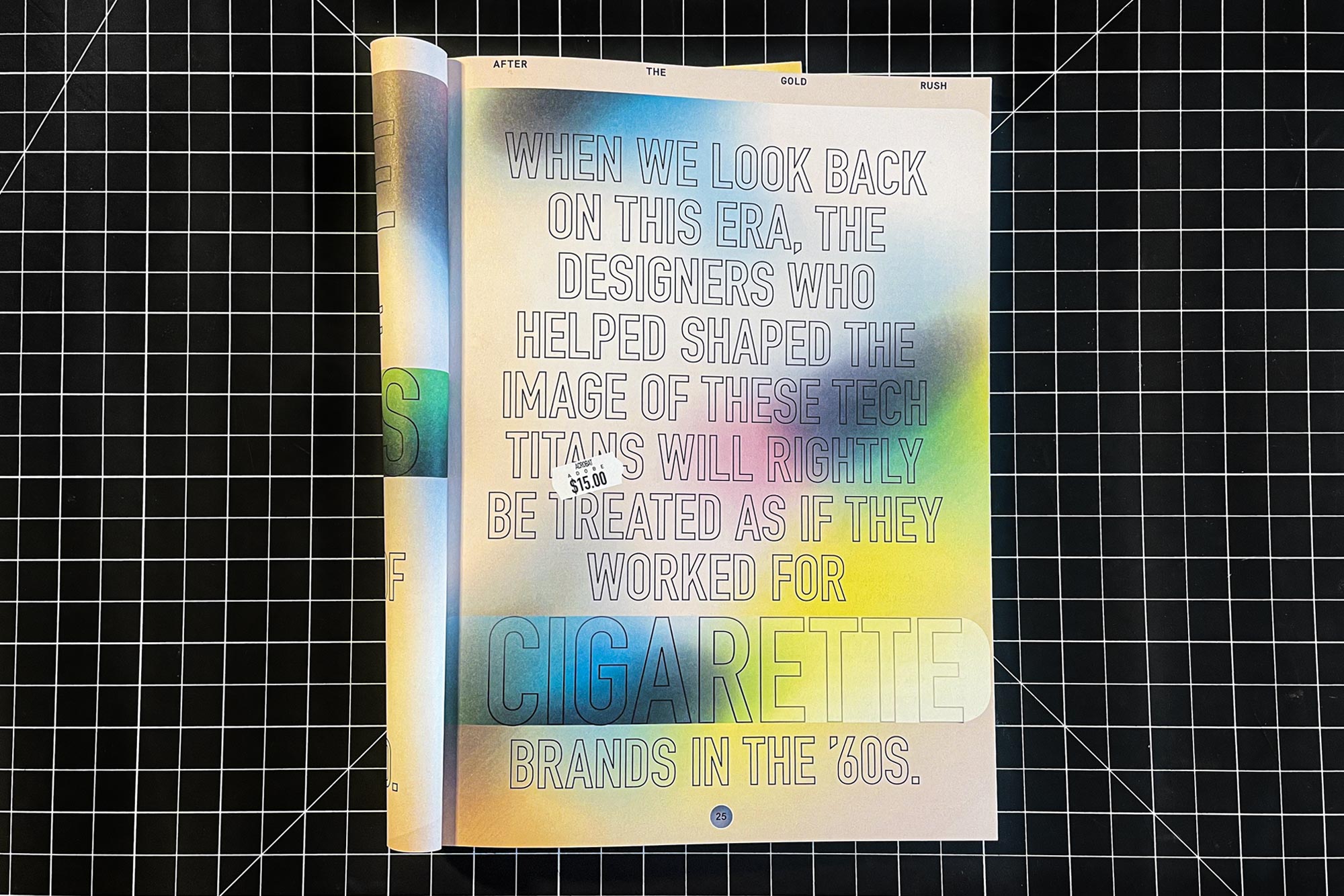
After the Gold Rush
A decade ago, the center of the design universe was New York City. Now designer reflects on the mass migration of talent to Silicon Valley
Eye on Design Magazine, issue #4, 2019
A former colleague of mine, Lindsay Ballant, remains on the East Coast as a teacher, political designer, and art director of The Baffler magazine. She has been offered jobs in Silicon Valley, but turned them down on philosophical grounds. “When we look back on this era, the designers who helped shape the image of these tech titans will be rightly treated as if they worked for cigarette brands in the ’60’s. We wouldn’t be celebrating good design from Halliburton or Palantir, would we? I must have missed the moment when a bunch of Raytheon designers were invited to speak at design conferences.”

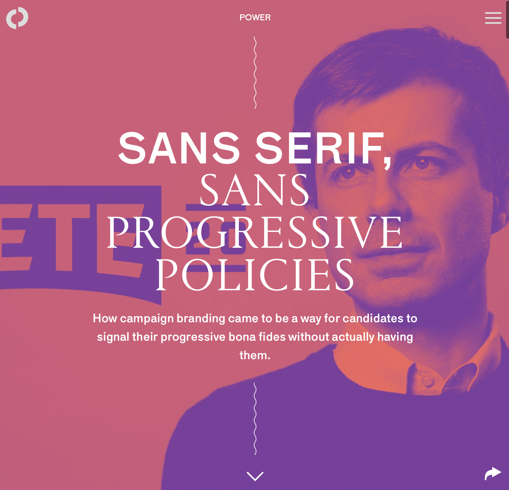
We Asked Design Experts What They Think About Pete Buttigieg the Brand
Jezebel, 04/17/2019
It’s clear Americana—and as Lindsay Ballant, the art director for The Baffler, wrote on Twitter of Buttigieg’s logo, that retro look is intentional. It is, she wrote, meant to evoke notions of blue-collar, middle America, a look that is “muddled” due to the myriad of designers “using industrial-era type and imagery for anything these days.”

How Pete Buttigieg’s Branding Went From Traditional to Opensource
AIGA Eye on Design, 05/23/2019
The release of this toolkit has not been without its criticism. Some, like art director of The Baffler Lindsay Ballant, consider it a faux-grassroots approach to opensource distribution; that by instituting guidelines, it only allows supporters to participate in the design process on the design team’s terms. And the timing of the toolkit, which was released before specific policy information was published, has also been critiqued by those eager to hear more about Buttigieg’s stance on the issues.
Sans Serif, Sans Progressive Policies
How campaign branding came to be a way for candidates to signal their progressive bona fides without actually having them
The Outline, 07/03/2019
There may, however, be a natural limit to the efficacy of a carefully cultivated, unearned foray into outsider and populist aesthetics. Lindsay Ballant, the art director at The Baffler, compared the procession of cookie-cutter T-shirts and banners found at Hillary Clinton’s rallies to the handmade signs and fan art visible at Bernie Sanders’s in 2016. “Bernie’s campaign,” Ballant writes, “has harnessed the enthusiasm of the supporters who are, in turn, shaping his message, while Hillary’s top-down campaign messaging dictates to their voter base that this election is about her—the celebrity, the icon—not them.”

Don’t Worry, These Gangly-armed Cartoons Are Here to Protect You From Big Tech
AIGA Eye on Design, 08/21/2019
The political predicament the Alegria style faces has less to do with the aesthetic itself than it does with the harmful corporations for which it has become the happy, kinetic face. The style appears to serve as the illustrative arm of an intentional deployment of cheerful minimalism to mask the insidiousness of multinational tech corporations with friendliness and approachability. Lindsay Ballant, art director of The Baffler, connects the style’s ascension with trends in global politics at the time.
“If you look at it globally, there were a bunch of austerity measures happening in 2014 in particular, and a lot of these repercussions of neoliberalism sort of hit globally then,” says Ballant. “It just seemed like there was a real concerted effort to mask that sort of stuff.”
In May, Ballant sharply divided illustrators on Twitter when she expressed her bemusement at the disproportionate number of illustrators sending her their Alegria-style portfolios. That the style is being frequently pitched to a leftist magazine, of all places, speaks to its overwhelming saturation, Ballant argues. “Some areas of the design world are going through reckonings of what class and identity mean,” she says. “Especially for an industry that goes out of its way to tell itself that its doing world-changing, feel good things. But I think that maybe the illustration industry hasn’t quite had that reckoning.”